自動適配不同平台操作體驗
適配哲學
平台適配通常有兩種情形:
-
作業系統所特有的操作體驗(例如文字編輯和捲動)。如果操作體驗與作業系統不一致,則通常會被認為是『錯誤的』。
-
使用 OEM 提供的 SDK 實現的功能體驗(例如 iOS 常使用的頁籤, Android 使用 android.app.AlertDialog 顯示一個提示視窗)。
本文囊括了 Flutter 為解決情形 1 而提供的覆蓋 Android 和 iOS 的自動適配。
對於情形 2,Flutter 提供了一些工具可以生成符合平台習慣的體驗,但是不會根據平台自動適配,需要根據 App 設計來手工選擇。更多有關的討論,請訪問 issue #8410 和這個文件 定義 Material/Cupertino widget 適配問題
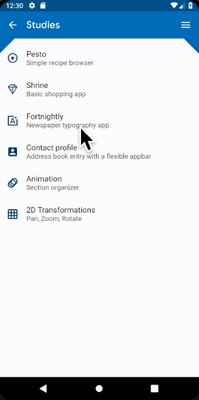
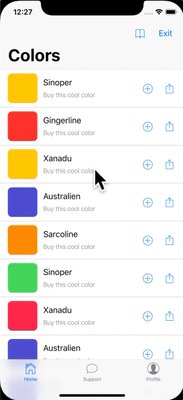
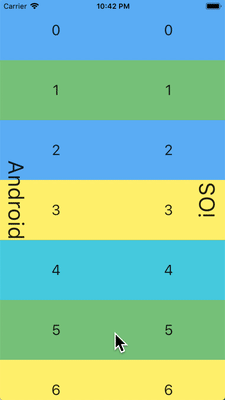
如果一個應用需要在 Android 和 iOS 不同架構上使用相同的程式碼,請參閱 platform_design 這份程式碼範例。
頁面導向
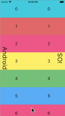
Flutter 分別為 Android 和 iOS 提供了各自平台的導向模式,並根據當前平台自動適配導向轉場動畫。
導向轉場動畫
Android 平台,預設提供的 Navigator.push()
轉場動畫模仿了 startActivity() 的動畫,即一種自下而上的動畫效果。
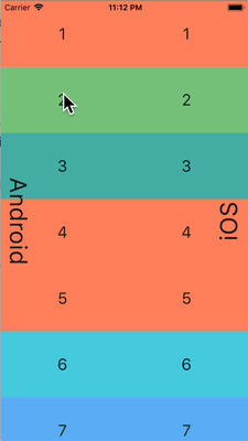
iOS 平台:
-
iOS 的
Navigator.push()API 提供了 iOS 上的 Show 轉場動畫(也被稱為 Push 轉場動畫),即根據語言的方向設定,執行一種從後到前的捲動動畫效果。在顯示新頁面的時候,原來的頁面也會沿著相同的方向進行視差捲動。 -
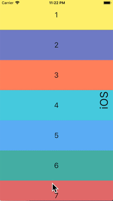
當顯示一個頁面,且
PageRoute.fullscreenDialog是 true 的時候, iOS 提供了另外一種自下而上的動畫效果。這個動畫通常被用在展示全屏模態頁,也被稱為 iOS 上的 Present 轉場動畫或 Modal 轉場動畫。
不同平台的轉場動畫細節
Android 平台上,Flutter 使用 ZoomPageTransitionsBuilder 轉場動畫。當用戶進行了路由跳轉,介面會縮放至下一個頁面。當用戶回傳上一頁時,介面會縮放回上一個頁面。
當在 iOS 平台上使用 Push 轉場特效的時候,
Flutter 內建的 CupertinoNavigationBar
和 CupertinoSliverNavigationBar
會自動的給當前頁下一頁的子元件使用正確的動畫效果(CupertinoNavigationBar 或者 CupertinoSliverNavigationBar)。
回傳導向
Android 平台,通常作業系統的回傳按鈕觸發的事件會發給 Flutter,並彈出 WidgetsApp 路由的最頂端。
iOS 平台,從螢幕邊緣的輕掃手勢會彈出路由的最頂端。
捲動
捲動是不同平台提供獨有體驗非常重要的一環, Flutter 會根據當前的平台自動適配捲動體驗。
物理模擬
Android 和 iOS 平台都提供了非常複雜的捲動物理模擬,因而很難用語言來描述。通常來說, iOS 的捲動通常提供更多的分量和動態的阻力;而 Android 則更多的使用靜態的阻力。所以,iOS 隨著捲動慢慢的達到高速,且不會突然的停止,而且在慢速的時候顯得更順滑。
捲動邊界行為
Android 平台,捲動達到邊界的時候,會顯示 捲動灰色指示 (具體顏色根據 Material 主題而有所不同)。
iOS 平台,捲動達到邊界的時候,會顯示一個 捲動邊界 的彈簧效果。

動量
iOS 平台,不停的按相同方向捲動會產生動量疊加,從而連續捲動速度會越來越快。在 Android 平台上沒有對應的行為。
回傳頂部
iOS 平台,點選作業系統的狀態欄,主要的捲軸控制器會捲動到頂部。 Android 沒有對應的行為(部分國產系統自己實現了該屬性)。
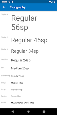
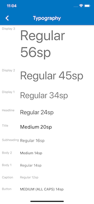
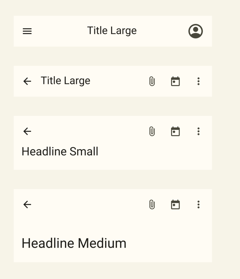
排版
當使用 Material package 的時候,排版會根據平台自動使用對應的字型。 Android 平台會使用 Roboto 字型,而 iOS 則會使用系統自帶的 San Francisco 字型。
當使用 Cupertino 套件的時候,預設主題 會使用 San Francisco 字型。
San Francisco 字型的授權限制了它只能被用在執行於 iOS、macOS 和 tvOS 平台上的軟體。因此當執行在 Android 平台的時候,即使強制覆蓋系統平台為 iOS 或者使用 Cupertino 預設主題,都會使用對應的替代字型。
你可以選擇將 Material widgets 的文字樣式適配到 iOS 的預設文字樣式。你可以在 UI 元件部分 看到特定元件的例子。
圖示
當使用 Material 套件的時候,根據平台不同,圖示的具體樣式會有差別。舉例來說,更多按鈕的圖示,Android 上是豎直的三個點而 iOS 是橫著的三個點;退回按鈕,iOS 是一個簡單的 V 型標記,而 Android 平台,V 型標記有個短橫線。


Material 也透過 Icons.adaptive 提供了一系列根據平台自適應的圖示。
觸控反饋
Material 和 Cupertino 套件在特定場景下都會自動觸發符合平台特點的觸控反饋。
例如,在文字輸入框控制元件裡面長按選中單詞會在 Android 裝置上會觸發震動,而 iOS 不會。
在 iOS 捲動選擇器專案清單,會觸發一個很輕的敲擊音效,而 Android 則不會。
文字編輯
Flutter 會根據當前平台來適配正確的文字編輯體驗。
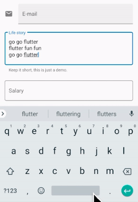
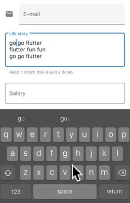
鍵盤手勢導向
Android 平台,在虛擬鍵盤空格鍵上可以透過左右輕掃來移動游標, Material 和 Cupertino 的文字輸入框控制元件都支援該屬性。
iOS 裝置提供了 3D Touch 相容,透過在虛擬鍵盤上使用長按並拖拽手勢可以任意方向移動游標。 Material 和 Cupertino 都對這個功能提供了支援。
文字選中工具欄
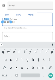
在 Android 平台上使用 Material,在文字輸入框裡面選中文字會顯示一個 Android 風格的文字選中工具欄。
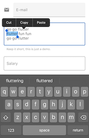
在 iOS 平台上使用 Material 或者在兩個平台上都使用 Cupertino,在文字輸入框裡面選中文字會展示一個 iOS 風格的文字選中工具欄。
點選手勢
在 Android 平台使用 Material,在文字控制元件中點擊會移動游標到點擊處。
同時,游標會有一個可移動的把手,隨後可以透過這個把手移動游標。
在 iOS 平台使用 Material 或者在兩個平台都使用 Cupertino,在文字空間中點擊,會把游標移動到點選處最近的單詞末尾。
在 iOS 平台上,游標是沒有把手的。
長按手勢
在 Android 平台使用 Material,在單詞上長按會選中單詞,並在釋放長按的時候顯示文字選中工具欄。
在 iOS 平台使用 Material 或者在兩個平台都使用 Cupertino,長按會把游標放置到長按的位置,並在釋放長按的時候顯示文字選中工具欄。
長按並拖放手勢
在 Android 平台上使用 Material,長按並拖拽會選中更多單詞。
在 iOS 平台使用 Material 或者在兩個平台都使用 Cupertino,長按並拖拽會移動游標。
雙擊手勢
Android 和 iOS 平台上,雙擊選中一個單詞都會收到雙擊手勢事件,並顯示文字選中工具欄。
UI 元件
本節包含有關如何調整 Material widget 以在 iOS 上提供自然且亮眼的體驗的初步提議。歡迎你對問題 issue #8427 提出反饋。
帶有 .adaptive() 構造的 widget
部分 widget 帶有 .adaptive() 構造。下方的表列出了這些 widget。當應用程式在 iOS 裝置上執行時,它們會自動以 Cupertino 的元件構造。
這些 widget 主要用於輸入、選擇和顯示系統訊息。由於它們與系統高度相關,使用者可能已經習慣於與它們產生對應的記憶和反應。因此我們建議你在應用程式中採用各自平台的轉化內容。
| Material Widget | Cupertino Widget | Adaptive Constructor |
|---|---|---|
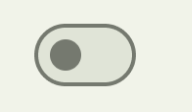 Switch
|
 CupertinoSwitch
|
Switch.adaptive() |
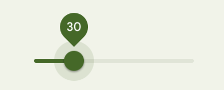 Slider
|
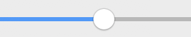 CupertinoSlider
|
Slider.adaptive() |
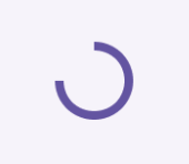 CircularProgressIndicator
|
 CupertinoActivityIndicator
|
CircularProgressIndicator.adaptive() |
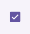 Checkbox
|
 CupertinoCheckbox
|
Checkbox.adaptive() |
 Radio
|
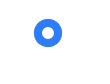 CupertinoRadio
|
Radio.adaptive() |
頂部應用欄和導向欄
自 Android 12 起,頂部應用欄的介面遵循 Material 3 中定義的設計指南。在 iOS 上,Apple 的人機界面指南 (HIG) 中定義了一個名為「導向欄」的等效元件。
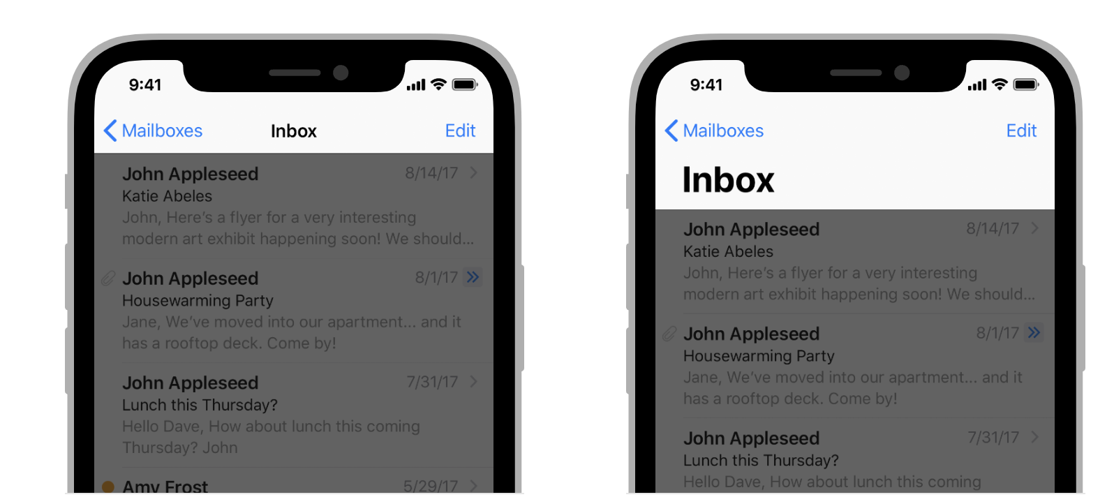
Flutter 應用程式中應用欄的某些屬性,例如系統圖標和頁面轉場,都應該進行調整。使用 Material AppBar 和 SliverAppBar widget 時,這些屬性都已經自動調整。你還可以進一步自定義它們的屬性,以更好地對應 iOS 的平台風格,如下所示。
// Map the text theme to iOS styles
TextTheme cupertinoTextTheme = TextTheme(
    headlineMedium: CupertinoThemeData()
        .textTheme
        .navLargeTitleTextStyle
         // fixes a small bug with spacing
        .copyWith(letterSpacing: -1.5),
    titleLarge: CupertinoThemeData().textTheme.navTitleTextStyle)
...

// Use iOS text theme on iOS devices
ThemeData(
      textTheme: Platform.isIOS ? cupertinoTextTheme : null,
      ...
)
...

// Modify AppBar properties
AppBar(
        surfaceTintColor: Platform.isIOS ? Colors.transparent : null,
        shadowColor: Platform.isIOS ? CupertinoColors.darkBackgroundGray : null,
        scrolledUnderElevation: Platform.isIOS ? .1 : null,
        toolbarHeight: Platform.isIOS ? 44 : null,
        ...
      ),
但是,由於頂欄是與頁面中的其他內容一起顯示的,因此我們只建議調整樣式,它只要能與應用程式的其餘部分保持一致即可。你可以在 有關應用欄適配的 GitHub 討論中 檢視其他程式碼範例和進一步說明。
Bottom navigation bars
自 Android 12 起,底部導向欄的介面遵循 Material 3 中定義的設計指南。在 iOS 上,Apple 的人機界面指南 (HIG) 中定義了一個名為「標籤頁欄」的等效元件。
由於標籤欄在你的應用程式中是持續存在的,因此它們應該與你自己的品牌對應。如果你選擇在 Android 上使用 Material 的預設樣式,你應該要在考慮在 iOS 平台上使用 iOS 的標籤頁欄。
如果你要實現特定於平台的底部導向欄,可以在 Android 上使用 Flutter 的 NavigationBar 小部件,在 iOS 上使用 CupertinoTabBar 小部件。下面是用於顯示特定於平台的導向欄的程式碼片段。
final Map<String, Icon> _navigationItems = {
    'Menu': Platform.isIOS ? Icon(CupertinoIcons.house_fill) : Icon(Icons.home),
    'Order': Icon(Icons.adaptive.share),
  };

...

Scaffold(
  body: _currentWidget,
  bottomNavigationBar: Platform.isIOS
          ? CupertinoTabBar(
              currentIndex: _currentIndex,
              onTap: (index) {
                setState(() => _currentIndex = index);
                _loadScreen();
              },
              items: _navigationItems.entries
                  .map<BottomNavigationBarItem>(
                      (entry) => BottomNavigationBarItem(
                            icon: entry.value,
                            label: entry.key,
                          ))
                  .toList(),
            )
          : NavigationBar(
              selectedIndex: _currentIndex,
              onDestinationSelected: (index) {
                setState(() => _currentIndex = index);
                _loadScreen();
              },
              destinations: _navigationItems.entries
                  .map<Widget>((entry) => NavigationDestination(
                        icon: entry.value,
                        label: entry.key,
                      ))
                  .toList(),
            ));
文字輸入
自 Android 12 起,文字輸入元件的介面遵循 Material 3 中定義的設計指南。在 iOS 上,Apple 的人機界面指南 (HIG) 中定義了一個名為「文字欄」的等效元件。
由於使用者需要用文字欄來輸入,因此它們應該遵循平台習慣來展示。
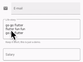
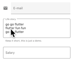
你可以調整 Material 材質的 TextField 的樣式來實現對應平台的 TextField。
Widget _createAdaptiveTextField() {
  final _border = OutlineInputBorder(
    borderSide: BorderSide(color: CupertinoColors.lightBackgroundGray),
  );

  final iOSDecoration = InputDecoration(
    border: _border,
    enabledBorder: _border,
    focusedBorder: _border,
    filled: true,
    fillColor: CupertinoColors.white,
    hoverColor: CupertinoColors.white,
    contentPadding: EdgeInsets.fromLTRB(10, 0, 0, 0),
  );

  return Platform.isIOS
      ? SizedBox(
          height: 36.0,
          child: TextField(
            decoration: iOSDecoration,
          ),
        )
      : TextField();
}
若你想要瞭解有關調整文字欄位的更多訊息,請檢視 有關文字欄位的 GitHub 討論。你可以在討論中留下反饋或提出問題。
提醒對話框
自 Android 12 起,提醒對話框的介面遵循 Material 3 中定義的設計指南。在 iOS 上,Apple 的人機界面指南 (HIG) 中定義了一個名為「提醒」的等效元件。
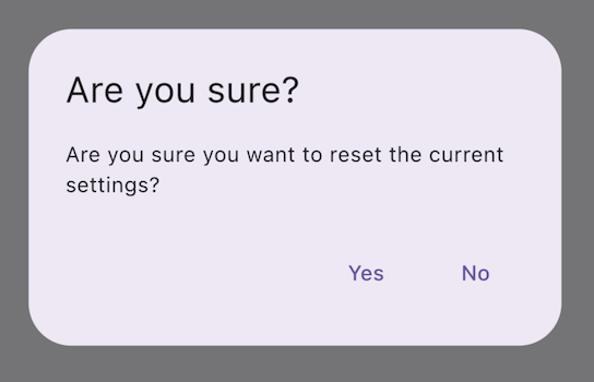
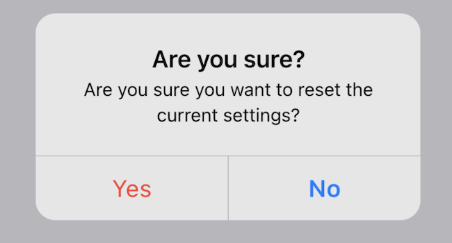
由於提醒與系統高度相關,通常應當遵循平台習慣來實現它們。對話框的實現對於使用對話框請求使用者輸入安全、隱私或破壞性操作(例如永久刪除檔案)而言至關重要。而與品牌相關的提醒對話框可以以不打斷使用者流程的方式,高亮特定的內容。
如果你要實現特定於平台的提示對話框,可以在 Android 上使用 Flutter 的 AlertDialog 小部件,在 iOS 上使用 CupertinoAlertDialog 小部件。下面是用於顯示特定於平台的提醒對話框的程式碼片段。
void _showAdaptiveDialog(
  context, {
  required Text title,
  required Text content,
  required List<Widget> actions,
}) {
  Platform.isIOS || Platform.isMacOS
      ? showCupertinoDialog<String>(
          context: context,
          builder: (BuildContext context) => CupertinoAlertDialog(
            title: title,
            content: content,
            actions: actions,
          ),
        )
      : showDialog(
          context: context,
          builder: (BuildContext context) => AlertDialog(
            title: title,
            content: content,
            actions: actions,
          ),
        );
}
若你想要瞭解有關提醒對話框適配問題的更多訊息,請檢視 有關對話框適配的 GitHub 討論。你可以在討論中留下反饋或提出問題。